


What is Business Intelligence (BI) Reporting?
Business intelligence reporting is broadly defined as the preparation and analysis of data, using specialized software to uncover actionable insights. Through those insights, BI reporting enables the tracking of metrics, which leads to improved decisions and increases performance at the user and company level. It can also examine vast data relationships between systems and identify trends, known as time series data. For example, BI reporting can examine accounts payable information over time, by region, by product, and by vendor. It then produces time series data that will reveal patterns, which in turn can highlight areas of improvement, benefiting profitability and customer satisfaction.
The Benefits of Business Intelligence Reporting
BI reporting equips businesses with data-driven insights on a variety of measurable actions via metrics. Targets can include promotional activities, customer interactions, and other business activities with the intent of measuring return on investment (ROI). Through timely reporting, a company can see which activities are working well and which are inefficient and adjust its efforts accordingly.
BI reporting also enables organizations to track metrics—key performance indicators (KPIs)—and monitor their progress towards goals. Common KPIs include sales growth, market penetration, and client retention. Reporting on this progress makes data-driven forecasting easier. Furthermore, it aids in spotting market trends and openings. In the life science space, for example, BI reporting can analyze prescription data to reveal prevailing trends or analyze market share to identify competitors.
By offering a centralized and uniform view of the data, BI reporting improves accountability and transparency within an organization. Within the pharma commercial space, it supports effective performance evaluation by simplifying forecasting, territory management, and incentive compensation analysis.
Drawbacks in the Prevalent Reporting of KPIs
A popular way to visualize the results in BI reporting is through a line chart (time series graph) or a bar graph. The increases and decreases of the desired KPI can readily be displayed across any given timeframe. Figure 1 shows a typical BI visualization for pharma, using the example of discontinuation rate (DR), which tracks when a patient or doctor stops medication treatment.
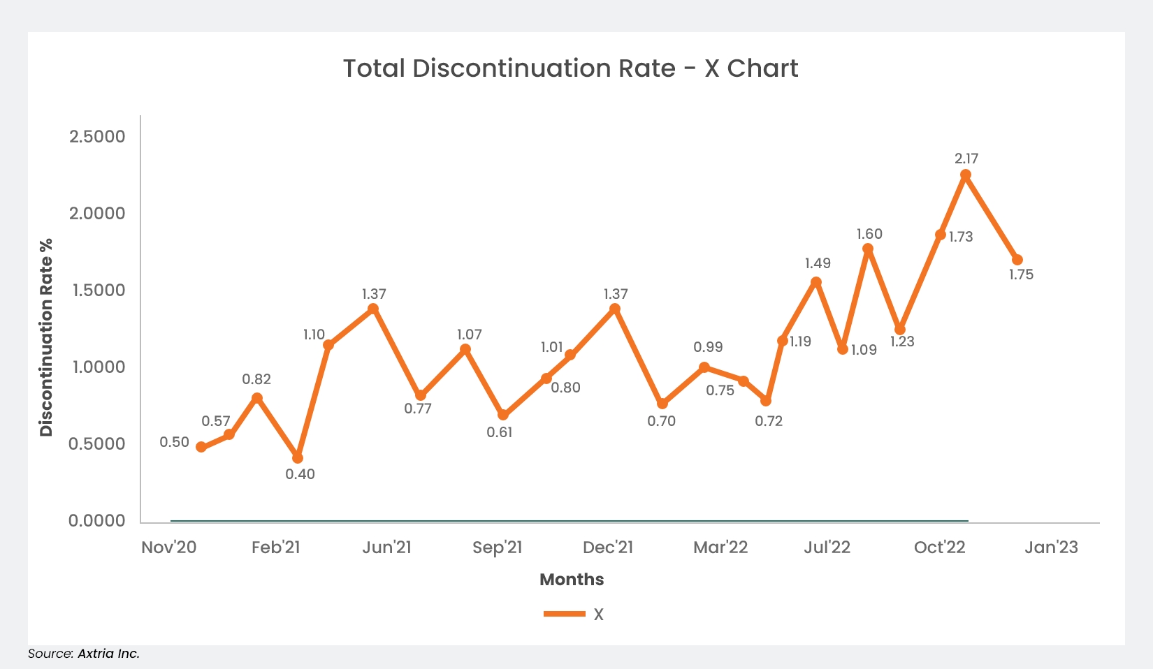
Figure 1: A typical BI reporting line chart in pharma
While this BI reporting chart gives an excellent picture of how the KPI varies over time, it does have some drawbacks:
First, there may be an urge to make changes addressing the downturns. However, whether the peaks and valleys are routine for the process or the result of outside factors is unclear. This can lead to a tricky situation where inherent variations are thought to be external, leading to explanations that are unlikely to be correct. Any actions taken to address a misinterpreted inherent variation could have detrimental effects: wasted effort, undeserved blame or credit, and undue stress for employees.
-
We can see an example of this in Figure 1 above. Notice a high increase in DR, from 0.4 in April 2021 to 1.1 in May 2021. We may be inclined to find a reason for the increase. However, as we will see later in Figure 2, the change is inherent to the process, as revealed by a specialized type of chart known as an XmR chart.
Secondly, and closely related to the first drawback, users may fail to look for reasons even when the variation is external to the process. This is particularly likely to happen when the variation is within acceptable limits or predetermined targets. A large shift deemed acceptable may have been caused by avoidable stimuli. This results in loss due to missed opportunities for improvement.
A Closer Look at BI Reporting Variations
Inherent variations are also called “common cause variation,” while the external factors affecting KPIs are called “special causes.” Common causes exist due to the design of the system or the way it is managed. These variations are expected, the variance ranges are known, and the corresponding process is said to be stable. Improvements can be made only by changes to the process or system. Conversely, special causes are variations that are not part of the system. For example, a sudden increase or decrease in monthly sales could be due to unexpected new orders. The corresponding process is said to be unstable. By identifying and responding to the external causes, the system can be returned to its original state.
Control Charts – An Introduction
A specific type of BI reporting can differentiate between common and special causes, and the solution has been around for a century. In 1924, while working for Western Electric, Dr. Walter Shewhart developed the control chart as a way to reduce variations in manufacturing processes.1 The most universally used control charts are XmR charts, which can be used for all types of data and processes in manufacturing and services.
They are, in essence, two charts placed above and below each other: the individual data points along a timeline (called X), and the moving range (called mR), which is the difference between each point on the timeline. They include a central line for the average, an upper line for the upper control limit, and a lower line for the lower control limit. They are a far better way to depict KPIs.
To create an XmR chart, first gather several data points. Each one must happen consecutively. These plots will be on the upper chart, while the chart for the moving ranges will be placed below it. Next, calculate the average of those points. This will be the baseline, or central line. After that, measure the absolute difference between each point in successive order. This series of differences will be the moving range. Calculate that average, too; it will be used shortly.
Next comes the limits that make the XmR chart so helpful: the upper and lower control limits. These are also called “natural process limits” and represent the routine variations for the process being measured. They are the “voice of the process” and are calculated like this:
UPPER CONTROL LIMIT (UCL) = CENTRAL LINE PLUS (AVERAGE MOVING RANGE TIMES 2.66)
LOWER CONTROL LIMIT (LCL) = CENTRAL LINE MINUS (AVERAGE MOVING RANGE TIMES 2.66)
2.66 is used as a constant and is customary in this formula. It represents limits that are roughly three standard deviations from the central line.2
Additionally, for the mR section of the chart:
UPPER RANGE LIMIT (URL) = AVERAGE MOVING RANGE TIMES 3.27
As we did above, we use a constant here; 3.27 is customary for this formula. It also represents a limit of about three standard deviations—this time from the average moving range.
Once these are drawn on the chart, spotting the plot points that fall outside the process limits is easy. If none do, and only common causes are present, the process is said to be in statistical control. However, any other point is called a signal and rules can be set to help identify the special (or assignable) causes for those signals. In his book Making Sense of Data3, Donald J. Wheeler laid out several examples of what may be considered a signal:
-
Any point outside of the control limits,
-
A run of eight points, all above or all below the central line,
-
A run of eight points, all either increasing or decreasing,
-
Three out of four successive values in the upper 25% of the region between the limits, or three out of four successive values in the lower 25% of the region between the limits,
-
A pattern persistently repeating eight or more times must be due to an assignable cause and the user should investigate,
-
Any point above the upper range limit in the MR chart.
With an understanding of variation, common and special causes, and the potential mistakes, let’s revisit Figure 1 and apply an XmR chart. Instead of merely a time-series graph, Figure 2 below is now a control chart.
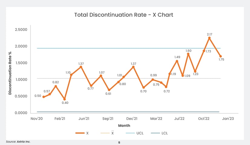
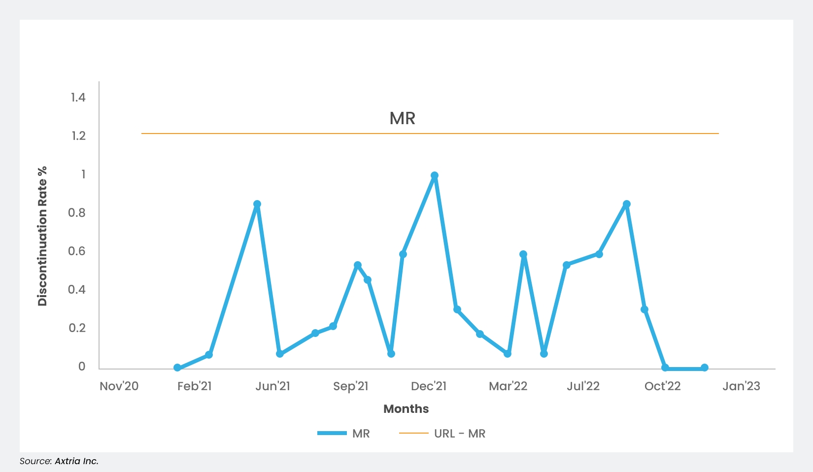
Figure 2: An example XmR control chart tracking a drug’s discontinuation rate, with upper and lower control limits
In the above X chart, the orange line (X) represents the discontinuation rate. The gray line represents the average of those values. The sky blue line represents the upper control limit, and the blue line represents the lower control limit.
Diving deeper, we can see from the XmR chart that, in this example, there were no signals from the start of the chart until May 2022. That indicates all variations were inherent in the process to that point, and it would be futile to investigate their reasons. This avoids the first type of drawback mentioned earlier.
However, from May 2022 through December 2022, we see eight consecutive values above the average. According to the rules we laid out, this is a signal, and the special cause should be investigated. This helps bring the process back into statistical control and avoids the second type of drawback previously mentioned.
The control chart further enables users to assess the results of changes made in the process. In the Figure 2 example, suppose a change is made to reduce the discontinuation rate. If the next eight values after the change are all below average, it becomes a signal under the rules. Only this time, it indicates the change made was successful.
Takeaways
-
A control chart is a statistical tool that measures variations in a process and distinguishes between the common or special causes of those deviations. In a control chart, the control limits are the natural process limits, or the “voice of the process.” These limits have nothing to do with what the management wants. A large percentage difference may not necessarily be a signal, and a slight difference may not necessarily be a lack of signal.
-
Control charts can reveal signals that require special attention: one point outside the control limits, eight or more points in a row above or below the average, and eight or more points in an increasing or decreasing trend.
-
Control charts offer us timely identification and elimination of special causes. They help us monitor the process to ensure it is stable and predictable when only common causes exist. They allow us to make changes focused on improving the process and assessing whether those have succeeded.
-
Control charts also enable us to assess the results of changes aimed at improvement—whether these changes have been fruitful or not.
Conclusion
The need for business intelligence reporting is right there in the name: intelligence. Companies need to know what works and what doesn’t so they can make better use of their resources. Charts can help, but it will be pointless if they do not show the complete picture—no matter how many data points there are. BI tools have given businesses a proven method of bringing about ongoing advancements in quality and productivity. While BI reporting minimizes some wasteful effort, XmR control charts take it one step further by eliminating the mistake of assigning causes where none exist. For the past 100 years, these control charts have guided companies’ decision-making and have been helpful wherever applied. They are an indispensable tool for optimization. And today, they are easily accessible within all modern BI reporting software suites. It has never been easier for companies to find that signal within the noise.
This article is contributed by Rohit Mathur, Associate Director at Axtria.
References
- Best M, Neuhauser D. Walter A Shewhart, 1924, and the Hawthorne factory. Qual Saf Health Care. April 2006;15(2):142-3. doi:10.1136/qshc.2006.018093
- Barr S. How to build an XmR chart for your KPI. Updated April 24, 2018. Accessed January 16, 2024. https://www.staceybarr.com/measure-up/build-xmr-chart-kpi/
- Wheeler, DJ. Making Sense of Data. Statistical Process Control Press; 2012.